
20.3.12
14.9.11

26.4.11
figtree lecture

Today we had a visit from 2 of the designers at Figtree. I'd previously been on their website and wasn't hugely impresses but they looked really really good from their presentation. It's been so far the most helpful and informative guest lecture we've had and I also really enjoyed it. The project they seem most proud of (and i agree they should be) is the on-going branding of HTC. They're a company who have blown onto the mobile phone market and i don't doubt for a second that this isn't partly due to Figtree's fantastic branding. They have a page and lots of videos on their website showing the whole process, but unfortunately I can't embed it so the link to it is here. These are a few other projects they have done:
 |
| Orange |
 |
| Walkley Fields |
21.4.11
american psycho

I saw this movie for the first time last night and it is definitely one of the greatest films I've seen. I'm not a huge fan of gory films but this one does it so well, and with just the right amount of humour-through-disbelief. This image is also fantastic, and if it wasn't so well known I would try and use it in something. Although maybe that's an advantage, that it's well known. i can imagine it being goos for a club night flyer or something.
18.4.11
isometric flashback

A while ago I tried a bit of isometric type and my mate reminded me about it so I'm going to try it again. Unfortunately this example isn't mine (it was done by a guy called Stu McAdam) but I love it. When I've played around with the idea I'll post some photos.

15.4.11
ambigram

This is a logo for Sallys club by Paperjam Design. It's an ambigram, meaning it can be read exactly the same when reversed. I love the simplicity of it and also the feeling you get from it - sophisticated but not too serious. I also like their thinking behind it, they say "SALLYS is an ambigram, as you can never be sure that printed matter in clubs will be viewed the right way up". Lovely.
13.4.11
rhoost packaging design


This is product packaging designed by a Boston based American company called Alphabet Arm. I really like a lot of the stuff they do, especially their CD art. These packaging designs caught my eye though as I really like the logo - its got a lovely flow to it - and also the direction illustrations on the back of the boxes. They're so simple and clear, but are also really visually pleasing.
5.4.11
storm thorgerson
Storm Thorgerson is in my opinion the greatest CD artist ever. If you've heard of him its probably because of this:
 |
| Pink Floyd - Dark Side of the Moon |
Although it's his most famous and iconic album sleeve design, I don't think its even near his best. These are some of my favourites by him:
 |
| Audioslave - Audioslave |
 |
| Biffy Clyro - Puzzle |
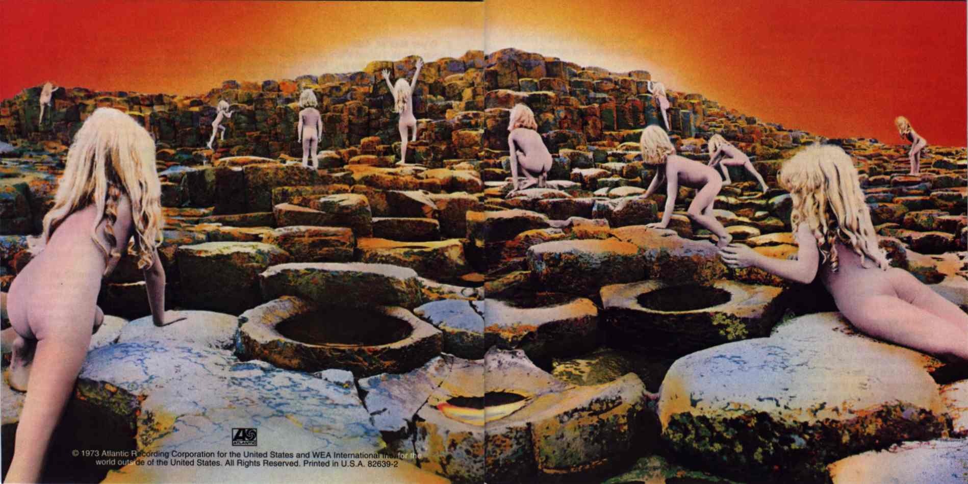 |
| Led Zeppelin - Houses of the Holy |
 |
| Muse - Absolution |
 |
| The Mars Volta - De-Loused in the Comatorium |
Coincidentally all of these albums are among my all-time favourites.
4.4.11
john stark

This is a wonderful oil painting by artist John Stark. I originally came across his work as he was commissioned to do a painting for Crystal Fighters' latest album 'Star of Love'.

I really like his style of painting - it's really original and looks almost like he did it on a computer. I'd love to see some of his work up close as I can imagine he uses texture and brushstrokes nicely. I also really like the nightmare-ish feel of his paintings, there's a lot of emotion and mystery within them. It reminds me a lot of Storm Thorgerson. I'll do a post on him tomorrow.

30.3.11
isklar n kettle chips

I've always loved the bottle design for Isklar, ever since I first saw them working in Waitrose. Blue Marlin is the guilty party and I like a few of their other brand designs too. Like what they've done for Kettle Chips:

They speak about how the brand was becoming over-run by new products entering the luxury crisp market so it needed a small re-vamp and de-clutter of the packaging. They've done it perfectly in my view.
Subscribe to:
Posts (Atom)